Friday 27 April 2012

Andy Potts


The illustrator that has inspired me is Andy Potts. He is an illustrator based in London but originates from the west midlands. Since he graduated from Portsmouth with a BA Hons degree in illustration he has took up a career in the image making, graphic design, animation and art direction including a 7 year stint as lead designer at Abbey Road Studios. Over the last then years the illustration has taken up most of his life and he has worked a large number of projects with a number of clients in advertising, book covers and work for magazines and newspapers. 

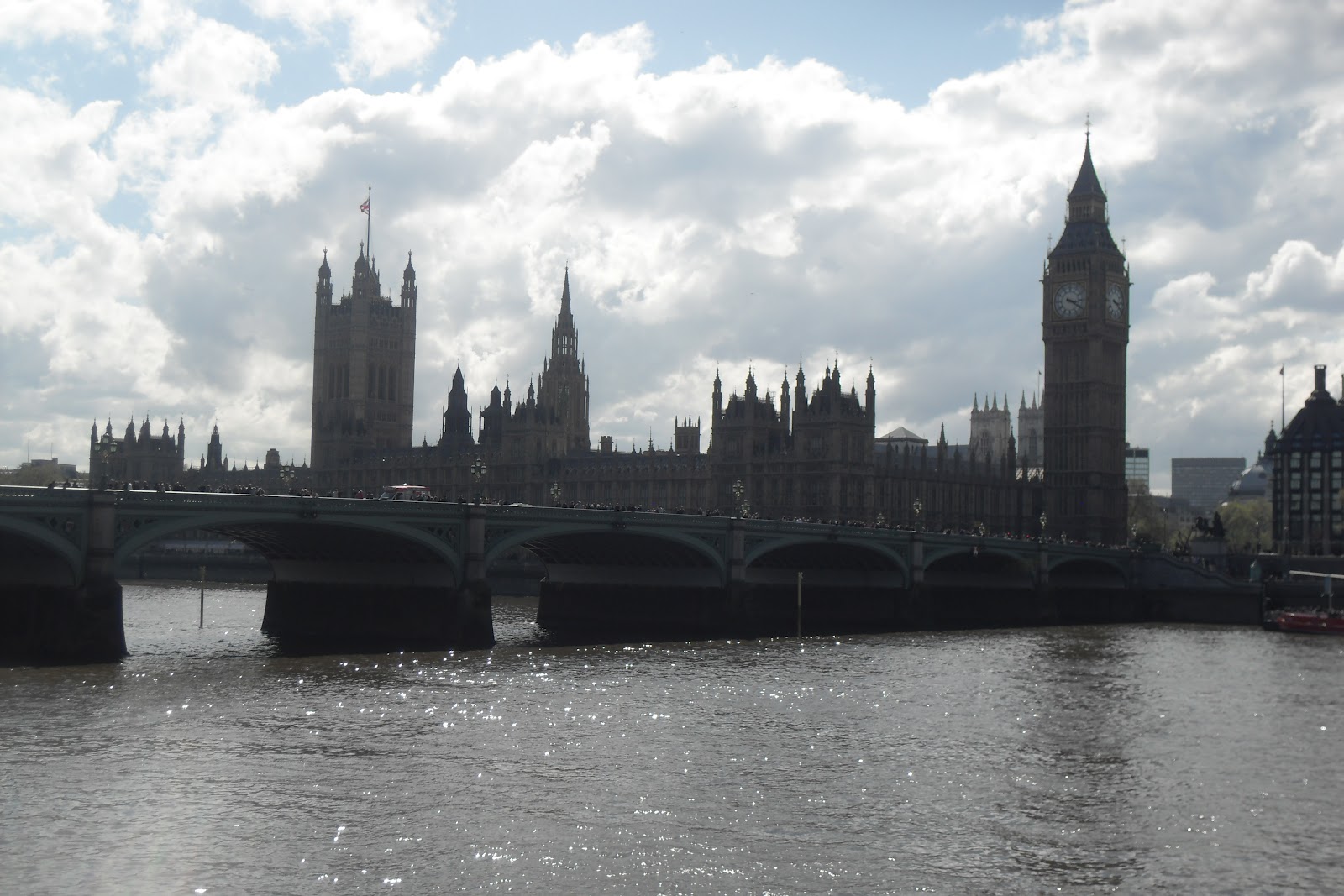
Andy Potts uses hand made designs combined with digital designs which creates these interesting creative pieces. For my final outcomes I have I am going to be using hand made designs combined with digital designs which is linked to Andy Potts' work. I am going to be using Landmarks in London such as the London eye, Big Ben, Trafalgar square, London Transport etc and combining them together to create a creative collage type of piece. For the handmade side I am going to print my outcome onto tracing paper which I will then create a Cyanotype. 

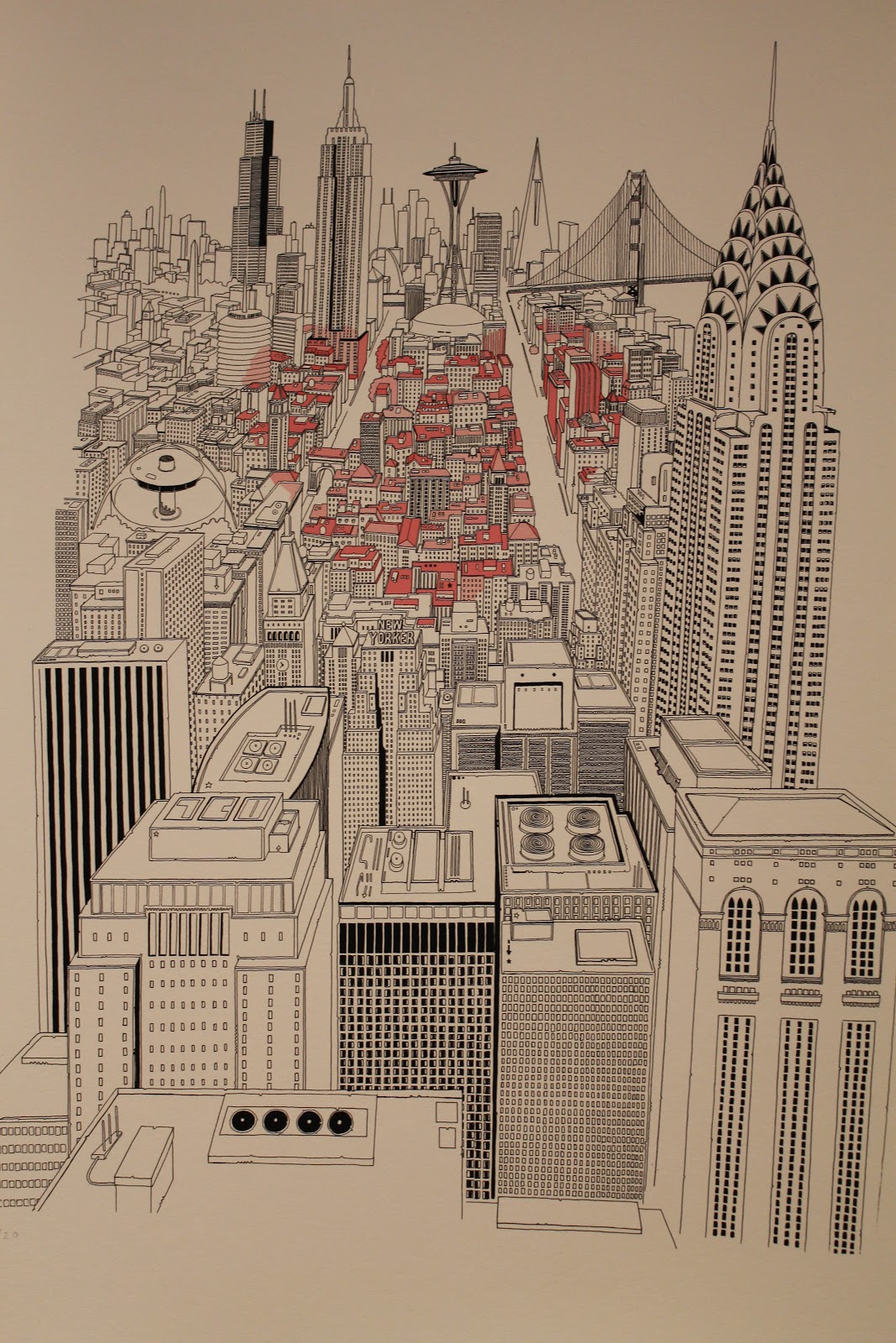
The images above are of Andy Potts' work which are my favourite pieces of work created by him and have inspired me in the ideas that I have come up with. Both are related to London which is the location I am going to be using and the images that he has used are the types of things I have been photographing. The top image is my overall favourite as it includes all the landmarks of London and also the colours of the British flag which is red, white and Blue. I also admire how the bottom image he has made a heart out of the bike route and added all the illustration inside of it which represents them as being the heart of London.

Wednesday 25 April 2012

South Bank Photographs


These are photographs that I captured on South Bank in London. I captured these images because my theme is to do with travel and landmarks, the London eye and bridge are well known landmarks in London and they represent London. For my final outcome I am going to be mainly including images of London and the famous landmarks. The photograph at the top is of a girl sitting underneath the London eye and also a lamp post that you would see all over central London, I think that this image creates a interesting scene as it shows the girl in focus and then has the London eye and lamp post slightly blurred in the background taking up most of the image. I also captured photographs of transport vehicles that are common in London and also signs and a policeman, policemen are very common in London and represent London, they could be seen as a live landmark.

Tuesday 24 April 2012

Experimentation


These are some photoshop experiments that I created with images of well known landmarks in London. I adjusted the thresh hold, hue saturation and used the pin hole light effect to create these interesting pieces. I am going to be using effects like these for my final outcome.

Tuesday 17 April 2012

Pick Me Up Exhibition

During the easter holidays I attended an exhibition where young artists displayed their graphical work for us to see and also to purchase. The exhibition was very exciting and inspiring as many of the artists work related to my theme and many of their pieces gave me new ideas and techniques that I could possibly use for my final piece. I managed to talk to a number of artists that gave me advice and different ways of making simple things look creative for example the piece on the left was made out of block colours of paper but has been put together in many different shapes and sizes to create this amazing vibrant landscape, that piece was created by a designer called Zee Loot.


This piece was created by a graphic designer named Chris Dent. This guy inspired most of all because his piece related to my theme of cities and buildings. This design was all hand drawn with a fine liner which is amazing with especially the detail that has gone into it. I like this piece most of all because of the creativeness that has gone into it, he has called this piece the 'City Heart' has you can see a pink heart that stands out in the centre, I admire the way he has coloured parts of the buildings to form the heart.


Chris Dent also had a tattoo on this arm of New York city that looked like a piece of art in itself. He gave me advice on different techniques he had used as a designer and what his favourite one was which was hand drawn with a fine liner, he said that it makes every single detail in the piece stand out and gives the piece more depth. He is a very inspiring graphic designer and I admire his work.


 These are two pieces that I found very interesting and the detail that went into them amazed me. The first design is of the inside of a human body that has been made out to look like it is one big factory with lots of machines inside and instruments etc. Unfortunately I didn't get to meet the artist that created this  but seeing the details up close was a great experience.


This piece amazed me also, it is of a dragon which has been made out of buildings. The creativeness of this design is mind blowing as such simple buildings can be made into such a work of art, a dragon and buildings don't really relate in any way but the two work perfectly together. Again I unfortunately didn't get to meet the designer who created this piece. This piece inspired me as it relates to my theme with buildings and landscape. A dragon is also part of the chinese culture which relates to travel.